Satin-Faced or Grosgrain Ribbon: Choosing the Right Surface
Compare satin-faced or grosgrain ribbon by sheen and texture, then choose a surface that complements your garment, gift wrap, or decoration.
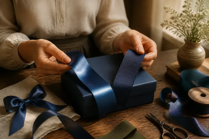
Satin-faced or grosgrain ribbon changes the look of a garment or gift before its color does. Satin reflects light across a smooth face; grosgrain shows narrow ribs that make texture visible at a glance.
How do satin-faced and grosgrain ribbon differ?
The main difference is the surface. Satin-faced ribbon has a smooth, light-catching face, while grosgrain has a ribbed one. Turn either sample beneath a lamp: the satin’s highlights shift with the angle, and the grosgrain’s ribs remain distinct.
Those names describe appearance, not a particular fiber. Both types can be made from different materials, so check the product label when fiber content matters. Construction also affects how a ribbon bends, drapes, or holds a fold.
Satin-faced ribbon tends to look polished because of its sheen. Grosgrain tends to look more textured and defined, though it may have some luster. Neither surface dictates whether a design is formal or casual; the surrounding materials and the way the ribbon is used also shape that impression.
Which ribbon surface suits the look you want?
Choose satin-faced ribbon when reflected light should be part of the design. It can give a bow, clothing accent, or gift finish a smooth, prominent highlight. That same shine can draw attention to creases and twists, so a sample is useful if the ribbon will sit beside a busy print or another glossy material.
Choose grosgrain when visible texture or a more defined edge will help. Its ribs can add contrast to smooth fabric or plain paper without relying on a strong shine. It can also suit formal designs; texture is not an informal-only affair.
For clothing, consider where the ribbon sits and how it will meet the garment. A decorative line at a neckline or cuff has a different role from a soft tie or bow. Check the ribbon’s fiber and construction, and consider whether its surface will rub against skin or another layer of fabric.
How should surrounding materials affect the choice?
Use surface contrast deliberately. Satin beside wool, matte cotton, or uncoated paper creates a shift from soft or subdued to polished. Grosgrain beside smooth fabric or a plain box makes the ribs the point. If the ribbon and backing look too similar, either surface may disappear into it.
Think of the choice like selecting a lampshade: a smooth, glossy finish catches and redirects attention, while a textured one gives the eye a quieter surface to read. The analogy is about visual effect, not a rule about which ribbon is better.
Imagine you have a small gift box wrapped in matte, deep-blue paper and two blue ribbon samples: satin-faced and grosgrain. Lay each sample on the lid under the light where the box will be displayed. If the satin highlight makes the lid look too busy, choose the grosgrain for a more subdued finish; if the ribbing blends into the paper and you want a visible accent, choose the satin. The observable difference is the highlight or texture against the same paper, not a claim that one finish is universally superior.
What questions help compare ribbon surfaces?
Does satin-faced ribbon always look shiny?
It has a smooth face that can catch light, but its apparent sheen varies with lighting, color, and viewing angle. Check a sample in the setting where you plan to use it.
Is grosgrain always stiff?
No. The ribs describe its surface, not how firmly it bends. Check how the actual ribbon folds and settles if your design needs soft loops or a fluid drape.
Can satin-faced and grosgrain ribbon be used together?
Yes, if each surface has a clear role, such as satin for a highlight and grosgrain for a textured edge. Compare the samples together so their colors and visual weight do not compete.
Which surface works better for a simple design?
Either can work: satin adds emphasis through sheen, while grosgrain adds it through texture. Choose the effect you want to notice first and keep other decorative details restrained.
What should you check before choosing a ribbon?
- Check the surface beside the intended fabric or paper; if the ribbon disappears into it, choose a more distinct texture or sheen.
- Check the sample under the project’s lighting; if satin’s highlights distract, choose grosgrain or a less reflective color.
- Check how the ribbon bends and settles; if it will not form the needed fold or drape, try a different construction.
- Check the fiber label when material content matters; if the listed fiber does not suit the project, choose a labeled alternative.
- Check where the ribbon will touch skin or other fabric; if the surface feels uncomfortable or catches, reposition it or select another ribbon.
- Check the ribbon from the distance at which the finished object will be seen; if its texture or sheen vanishes, choose a more visible contrast.
Compare physical samples rather than relying on a product photograph, which may not show the surface as it appears in your setting. Place each ribbon beside the intended material, change the viewing angle, and check whether the sheen or ribs remain visible from the usual viewing position.
Satin-faced or grosgrain ribbon is easier to choose once you decide what it should contribute: sheen, texture, contrast, or a quiet finishing line. Match that effect to the material around it, and the ribbon can finish the design without demanding the whole conversation.